Archive
Twitter journalism
Via Charles Crawford comes this interesting infographic thingummy about the rise of iPhone journalism from frugaldad.com
While I think Mr Crawford is over-egging it a bit to say all this means “goodbye photo-journalism” – really outstanding photo-journalism requires much the same high level of technical skill, a “good eye” and luck as it has always done, whereas iPhone journalism really requires minimal skill and maximum good luck in being in the right place at the right time – I think Frugaldad’s comment that the huge strides being made in smartphone technology, combined with their interconnectivity with social media websites such Facebook and Twitter, make such phones a formidable weapon in the journalist’s arsenal.
But a word of warning: as Riyaard Minty of Al-Jazeera comments, the citizen photo postings of the uprisings in Libya, Tunisia, Egypt and now Syria are “the primary lens” through which these events have been brought to the world’s attention – “primary”, as in “first”, not (as some befuddled editors of national newspapers and 24-hours news channels seem to think) the “only” lens.
Because just as a bunch of random tweets and Facebook messages thrown together do not a news story make, a bunch of iPhone photos from the scene of an ongoing news event, while immediately gripping, do not necessarily tell the whole story. Context is everything, and it requires a skilled journalist to pull together all the disparate, if related, elements together into something like a coherent whole.
North Korea: where is everybody?
The Independent has a remarkable slideshow of photos of North Korea by David McNeill here. They are definitely worth a look, and raise a few obvious questions and one, not so obvious, question:
Obvious: 1) Where is everybody? Many of these pictures were taken in Pyongyang, the capital, which has a population of 3.3 million. OK, it’s not London, but you’d expect a few more to be using the tube wouldn’t you? Or using the municipal swimming pool?
2) Picture 1: where is all the food?
There are some obvious points to be made here, almost all of which have been lost on the brain-dead trolls commenting on the Indy site: McNeill was working in a closed, ideological and totalitarian society; working within that society, and to be able to get his work out, required great ingenuity and artistic imagination to make his point; that he makes his point in images which are precise, technically brilliant (from the point of view of framing, composition, focus and that boring camera stuff).
And what is the not-so-obvious point about North Korea that McNeill so brilliantly captures in these images that he managed to get them past the all-censoring eyes of the Dear Leader’s flunkeys? Think of the famous Sherlock Homes story “Silver Blaze” – the one about the stolen race horse and the dog who didn’t bark in the night. Look at these photos and see the dog not barking. In other words, the things that are not there: not because they were airbrushed out or the Dear Leader didn’t want them depicted, but because they just weren’t there in the first place and never have been, nor are likely to be. They are likely to be the sort of things you take for granted to the extent that you don’t see them, even though they’re there before your eyes everyday.
Take that first photo: we’ve all seen fallow fields, but when was the last time when you ever passed a scene like that in the English countryside? Just one field among many that are producing something and the others…
I hope these wonderful photos are published in print with the space they deserve.
The Johann Hari way to photoshop an interview
Brian Whelan’s excellent expose of Johann Hari’s, shall we say, “creative” way with direct quotes and interviews – which itself follows another Hari expose here – is quite rightly receiving a lot of play on the mediablogs, such as FleetStreetBlues.
Most of the commentators have used the phrases “cut ‘n’ paste” and “mash-up” to describe what Hari has done, which is fine as far as it goes, but I think a more accurate analogy comes from the wonderful world of Photoshoppery.
Those of us who use the digital image editing program Photoshop for more than just the occasional colour correction or cut-out and drop shadow know there’s an incredibly handy tool called the Clone or commonly, because of its icon in the toolbar, the “Rubber Stamp”. This handy little gubbins lets you copy an area from one part of a picture and then “stamp” it on to another area. In the early incarnations of Photoshop, this was fairly crude – often the colour of the pixels in the copied area didn’t quite match those in the target area, so you had to massage them with, say, the smudge tool to make the transplant more seamless.
So far, so cut’n’paste. But over the years, this little tool has become increasingly sophisticated, to such an extent that Photoshop itself does the mixing, reading the pixels of the copy to those with the target and making whatever colour adjustments are necessary to either to make the transplant truly seamless, to the extent it would take a real expert to find where the join is. And it can do this with areas copied from another picture and stamped into another one, too: the adjustments are done automatically.
It would appear that Hari is more than just a bog standard cut’n’paste merchant. He is master of the photoshopped quotation, able to cut quotes from a variety of sources and paste them seamlessly into one coherent whole. The tenses match, the flow of the quotations remain unimpeded: they really do read like the direct reporting of what a person said at a single time and a single sitting at a single place. Except of course that it isn’t and they weren’t.
Astonishingly, Hari doesn’t seem to grasp what might be wrong with this in a report which purports to be the subject’s thoughts and behaviour at a single time and a single place:
My test for journalism is always – would the readers mind you did this, or prefer it? Would they rather I quoted an unclear sentence expressing a thought, or a clear sentence expressing the same thought by the same person very recently? Both give an accurate sense of what a person is like, but one makes their ideas as accessible as possible for the reader while also being an accurate portrait of the person.
Well, yes, Mr Hari, I guess most of us think there is nothing wrong with cleaning up the occasional grammatical lapse or deleting all the umms and errrs that occur in everyday extempore speech. Most British journalists would also have no qualms about reordering sentences within a direct quote to help make the sense flow, although our US counterparts tend to be more queasy about doing this.
But actually lifting quotes from a subject’s previous interviews, inserting them into other quotes and trying to pass it off all as what that subject said at a single interview is wrong. And it’s wrong for the same reason that photoshopped pictures purporting to show a single event in time and place are wrong.
An interview is after all a picture in words of a single event, if you like. It purports to be a faithful rendition of what was said and, in the case of the personalised “intellectual portraits” which Hari favours, what was done by the subject at a single point of time, just as a press photo should show what happened at a single point of time. To doctor either, either to make them more newsworthy or, in Hari’s disingenuous words, “make their ideas as accessible as possible” is nothing short of deceit.
Hari may well claim that none of his subjects have complained. Perhaps none of them noticed or, if they did, didn’t care. But then they’re not the ones who are really being deceived. It’s his readers to whom Hari owes an apology.
UPDATE: Nice to see the old Downfall Hitler meme is alive and well on YouTube and being put to good use.
UPDATE II: And of course The Daily Mash has got into the act.
The Indy’s magical monarchist moment
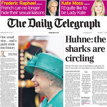
Her Maj’s historic (© all newspapers, airwaves, bandwidth) to Ireland dominates the front pages of the heavies today, but one particularly stood out from the newspaper rack I passed this morning.
Most went for the traditional “beautiful handbag and smiling hat” pictures. The Times:
The Guardian:
The Torygruff takes another tack, going for a deep, tightly cropped headshot, but none too successfully:
(Instead of looking out of the page, if she had been facing the other way, toward the lead story on les travails de Huhne, it might explain what she’s laughing at.)
But best of all for its unusual, striking treatment and its witty pairing one historic event with another is The Independent:
Pictures, a thousand words and other truisms
Further to my posts about the travails of Newsweek, from its arch-rival Time comes a splendid example of what a news weekly can do when it really knows what its business is about.
This front cover is, in my opinion, an instant classic: if you’ve been too busy rehashing that press release or twittering Kanye West or something and have missed all the media hoo-ha about it, it depicts Aisha, an 18-year-old Afghani girl whose nose and ears were cut off on the orders of the Taliban after she ran away from her abusive in-laws.
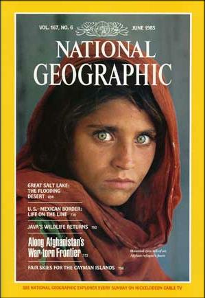
The image itself is striking enough: it is reminiscent in many ways of National Geographic’s famous Afghan girl cover from 25 years ago – it’s more unsettling twin.
Time’s cover certainly makes you stop and have a closer look: it’s then it reveals it has that quality that Yeats (in different circumstances) called “a terrible beauty”. The coverline, whether you agree with its sentiment or not, is perfectly judged (I’m talking in terms of layout only here), places the picture in context and provides that all-essential come-on to lure the reader in.
All-in-all, a perfect, simple and pleasing balance of form and content that in design terms is hard to fault.
Over at his excellent blog Iconic Photos I’m pleased to see The Quinessential agrees and has placed it on his online pantheon of classic images, along with comments from Time’s managing editor Richard Stengel:
We do not run this story or show this image either in support of the U.S. war effort or in opposition to it. We do it to illuminate what is actually happening on the ground.
If you love great photojournalism and great photography, and have a half-hour or so to spare while munching your lunchtime sarnies I really recommend checking out the iconicphotos.com site: it has all the classics you probably already know (JFK silhouetted leaning on the Oval Office desk, the hooded terrorist on the balcony outside the Israeli team apartment at the Munich Olympics) , quite a few you might have forgotten (Jesse Owens winning gold at the 1936 Olympics, Thomas Hoepker’s controversial 9/11 photo) and some you may not have known existed (the last photo of a stroke-stricken Lenin, the first underwater photo).
Definitely a site to bookmark.
UPDATE: As well as the Iconic Photos blog, another photographic site worth checking out I just discovered is this one of beautiful colour photos of 1930s Depression America. I’ve not seen any of these anywhere before.


