Archive
10 things you probably don’t know about Steve Jobs

Steve Jobs 1955-2011
1) In 1985, when he was being pushed out of Apple by CEO John Sculley, Steve Jobs was approached by NASA to be the civilian astronaut on the ill-fated Challenger mission. He baulked at the six-month training required and refused.

Berners-Lee's WWW on Jobs' NeXT
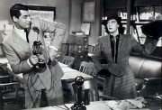
2) Tim Berners-Lee developed the first WorldWideWeb browser-editor using Steve Jobs’ NeXT, the pioneering hardware/software system he developed after being booted out of Apple (the operating system which Apple later bought and which later metamorphised into OSX, which today underpins the iPod, the iPhone, the iPad etc). “This had the advantage that there were some great tools available,” Berners-Lee wrote. “[I]t was a great computing environment in general. In fact, I could do in a couple of months what would take more like a year on other platforms, because on the NeXT, a lot of it was done for me already.”
3) In 1986, Star Wars director George Lucas sold the Graphics Project Computer Division of his Lucasfilm company to Steve Jobs for $10m because he urgently needed cash to complete his latest project, Howard the Duck. He originally wanted $30m, but Jobs beat him down to $10m. Howard the Duck bombed on release and is regularly castigated as one of the worst films ever made. Jobs renamed his new CGI company Pixar, And then…
4) At first, Steve Jobs had little to do with the day-to-day running of Pixar’s animation division, instead concentrating on creating the Pixar Image Computer, designed for weather, engineering, science and medical imaging. It bombed, selling fewer than 300, only 100 more than the original Wozniak-Jobs Apple I. On several occasions he even thought of flogging off the animation division, most infamously after “Black Friday” – November 19, 1993, when a calamitous screening of their work-in-progress, Toy Story, for Disney executives had Magic Kingdom executives seriously thinking of pulling the plug on the whole project. Luckily, Pixar’s in-house genius John Lasseter went away and re-thought the project. It was a huge success at pre-release screenings; Jobs took note and started to get more involved in Pixar, cannily gambling on floating the company a week after the release of Toy Story on November 22 – Thanksgiving weekend. As we know, Toy Story was the big success of 1995, guaranteeing the subsequent success of the IPO (initial public offering). Jobs held onto 80% of the shares, and virtually overnight he became a billionaire.

iMac: What's in a name?
5) Steve Jobs hated the name “iMac” and initially rejected it when it was suggested by Ken Segall, the creative director at Apple’s ad agency, TBWA\Chiat\Day. In a 2009 interview, Segall said:
He didn’t like ‘iMac’ when he saw it. I personally liked it, so I went back again with three or four new names, but I said we still liked iMac. He said: ‘I don’t hate it this week, but I still don’t like it.’
Segall then heard from friends that Jobs was having the name silk-screened on prototypes of the new Mac, to see how it looked:
He rejected it twice but then it just appeared on the machine. He never formally accepted it.
(To be fair to Jobs, he may not have initially liked the name iMac, but the TWBA honchos were in turn initially horrified when they first saw the bondi-blue bubble iMac. Segall says: “We were pretty shocked but we couldn’t be frank. We were guarded. We were being polite, but we were really thinking, ‘Jesus, do they know what they are doing?’ It was so radical.”)
6) Although Ridley Scott’s famous 1984 Macintosh ad is popularly believed to have been screened only once – during the Super Bowl XVIII clash between the LA Raiders and the hapless Washington Redskins – this was in fact the second time the ad had screened. It was initially aired at 1am on December 15, 1983, in Twin Falls, Idaho. With his usual marketing savvy, Steve Jobs had arranged for it to be screened on a small network at a time when hardly anyone would see it so it could be considered for that year’s ad awards. It duly won the Grand Prix at the 31st Cannes Lions International Advertising Festival in 1984.
Oddly, it almost never screened at all. While many of those who saw it loved it, one highly influential group hated it: Apple’s board of directors. After the initial screening in December 1983, board member Mike Markkula asked, “Who wants to move to find a new agency?”
The board left the decision of what to do with the commercial up to then-President John Sculley. Sculley ordered Chiat\Day to sell the air time it had bought, but the agency sold only 30 seconds of the 90 seconds it had bought, leaving just enough time for the full ad to run. An Apple VP finally gave the agency the go-ahead to run the famous 1984 spot during the Super Bowl.
7) Steve Jobs served on the Board of Directors at clothing retailer Gap from 1999 to 2002, during which time he attended only 66% of its meetings. At the same time he joined Gap’s board, Gap’s chairman Mickey Drexler joined Apple’s board. At the time, this swap was criticised by BusinessWeek, which at the time rated both companies’ boards among the “eight worst in America”. It’s not known what Jobs brought to the Gap board’s table (a move away from the company’s ubiquitous beige, perhaps?) but he must have picked up a few tips that came in handy when he opened the first Apple Stores on May 19, 2001.
9) Steve Jobs’ biological father was a Syrian Muslim immigrant to the US, Abdulfattah John Jandali, later a political science professor and even later a Nevada casino chain owner. Jandali and Jobs’ biological mother, Joanne Simpson (née Schieble), put the infant up for adoption because, Jandali says, her parents objected to their daughter marrying an Arab. (They did marry and had one daughter, the novelist Mona Simpson). Biological father and biological son never spoke to each other, let alone met.
10) Steve Jobs dropped out of his course at Reed College, in Portland, Oregon, on December 30, 1972, after only one semester, because of the financial pressure on his parents. However, he got permission from a college official to freely audit (ie, attend without getting an assessment or grade) classes, eventually settling on one in calligraphy. He slept on the floor in friends’ rooms or in unoccupied dorm rooms and returned Coke bottles to get money for food, with his weekly treat being a free vegetarian meal at the local Hare Krishna temple. He later said: “If I had never dropped in on that single calligraphy course in college, the Mac would have never had multiple typefaces or proportionally spaced fonts.”
The typography of politics
A reader alerts me to that rarity: an interesting article in the London Evening Standard.
Londoner’s Diary notes:
Simon Garfield, author of a book on fonts entitled Just My Type, notes that Barack Obama’s success was connected to his choice of letter style. Obama’s campaign used a new typeface called Gotham for the 2008 US election campaign. His challenger John McCain used Optima, often used in branded goods. “That was never going to work as it reminded people of the hygiene aisle in supermarkets.” Garfield noted that Obama’s choice of Gotham has caught on. “I can prove it was a success,” said Garfield. “Because Sarah Palin is using it.”
Well, I will put aside Garfield’s dubious claim that “Obama’s success was connected to his choice of letter style”, other than to note that many of the world’s present and most expensive ills and misunderstandings are due to commentators who wilfully, and often mendaciously, ignore that correlation does not equal causation (yes, I talking about you, George Monbiot. And you, Polly Toynbee. And you, Johann Hari. And you, the UN IPCC).
But as a saddo who loves typography and is a great collector of fonts, I was struck by Garfield’s analogy. Indeed, I can see it opening up an exciting new line of employment, with politicians hiring their own “Typography Special Advisors” to tell them when it is demographically advisable to use Comic Sans, or when a prevalence of ABs demands the use of serif fixed-width uppercase. In these times, anything which creates jobs is to be welcomed, no matter how mind-numbingly useless.
Londoner’s Diary didn’t supply samples of the two fonts used in the US elections. Here’s Gotham, a comparatively new font:

Gotham Bold: The typeface of Hopey-Change

Obama: Going gotham
Optima is a font I’ve always had a liking for: it has a certain formality loosened slightly by jauntiness, like that black-sheep uncle who attends a wedding in full morning suit, but murmurs suggestive jokes about the bride, the groom, the vicar and most of the principal guests in your ear throughout the service.
Despite what Garfield maintains, a search of McCain’s campaign posters only turned up a couple of examples of the use of Optima, so I’m not convinced it was ever adopted as his “official” typeface in quite the same way Gotham was Obama’s:

McCain and Palin go for the Optima
It’s a friendly, self-assured font, but not exactly one that exudes gravitas or authority. In the US, where they seem to elect everyone who claims a wage from the public purse, it would probably just the ticket for a candidate for the local dog-catcher, but not really the stuff for a presidential wannabe.
But I started thinking: what would be the typefaces best suited to our own political leaders?

Lib Dems: Everything they're Cracked up to be
Nick Clegg: Well, given he’s trying to hold together a party that splinters faster than a pinetree struck by lightning, what else could it be than Cracked?
Ed Miliband: The Labour leader’s perennial wide-eyed air of Year 7 ingenuousness immediately makes me think he could probably do with keeping within the straight and narrow, hence the choice of Schoolhouse Printed A.

Stay within the rules, Ed
David Cameron: I couldn’t find quite the right font for DC, so I had to fiddle around with an existing one (Apple Chancery) to come up with one that I call Red Rag To A Bullingdon. It’s posh, it’s expansive, it’s rosy-cheeked, but it does lean rather worryingly to the left:

Here you are, Dave, your very own font
This gun’s for hire
I'm a journalist with 30 years' experience in the dead tree and, latterly, online fields. Currently I'm working as a fast, accurate and above all reliable freelance working in both layout (fully tooled up with QuarkXpress and InDesign keyboard shortcuts) and copy editing. Add to that a pub-quiz-busting range of general knowledge, up-to-date knowledge of media law and that I'm usually available at short-notice - but will always consider short-term contracts - and it's obvious there's a lot of bang for your buck on offer here. Download my CV by clicking my pic above.
